
o everyone.
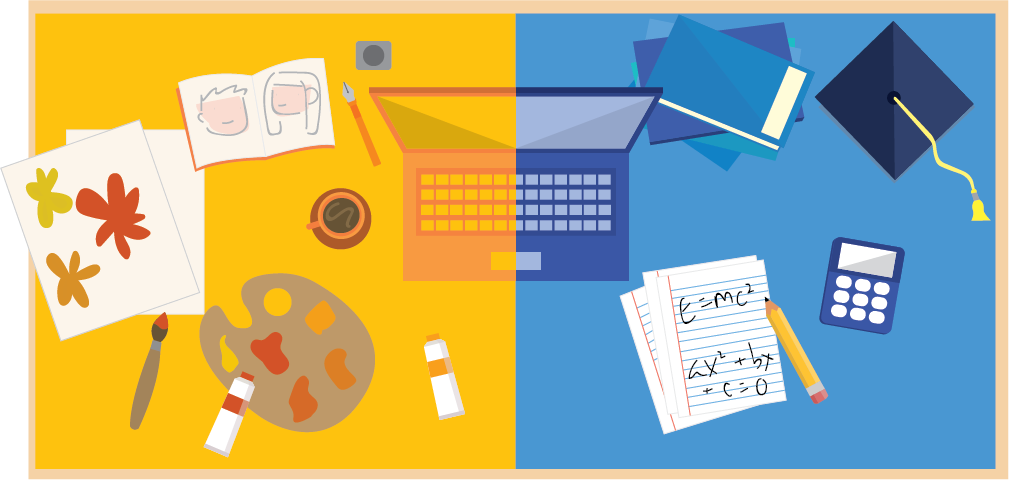
edX , the creators of Open edX, offer the main MOOC site edx.org which provides users opportunities to learn regardless of who and how old they are, as long as they have access to a computer. Countless institutions and nonprofit organizations have been using edX to offer access to quality educational and interactive content to their users.
One big advantage of edX is the ability to allow learners to learn at their own pace. Unlike traditional lectures in which students follow the same curriculum schedule and project deadlines as others, edX offers flexibility to those who are less positioned for traditional education.
Moreover, edX is a brilliant way to share knowledge since in a traditional lecture environment, there are maximum capacities and limited seating and yet in an edX course, content can be shared among tens of thousands of students while at the same time adhering to quality standards.
As an open-source software, almost every component can be modified to tailor the product to different types of clients and use-cases. However, it is important to keep lean design and development methodology in mind and focus on creating a minimum viable product offering the most learner/user value as soon as possible. Only then the user’s behavior, needs and wants can be understood to tailor the platform specifically for the them over time.
In this blog post, we will take an inside look at the process of user interface design ofan Open edX platform, specifically regarding the first cycle of the process: Creating the minimal viable product. This process can be divided down to three components— Research, Ideation, and Pre-implementation.
User Experience Research
With the end of this process, the Research portion then transitions towards understanding who your target audience is. Understanding your target user is one of the most important aspects of a project and one of the most important stakeholders. (Unless you are an infamous cable company of course).
The HBO show Silicon Valley exemplifies the fact that users can easily determine the fate of a project because in spite extraordinary talent and dedication devoted to the middle-out compression process, Pied Piper failed when they failed to understand their users.
It’s common to not have enough travel budget to visit and and interview target users, but this doesn’t mean there aren’t any opportunities to understand the user. One of the handiest tricks is creating user personas covering as many details as possible, just like the introduction of the movie Amelie, which provides irrelevant yet interesting facts of the personas, making them more believable.
Guiding the personas through the 5 E’s of User Experience would be the next step. The 5 E’s (Entice, Enter, Engage, Exit, and Extend) enables designers to gain a better systematic understanding of how they would interact with the interface and overall how the experience would be like for them. Here are some questions to ask yourself in each section:
|
Entice
How would they hear about this learning offering?? What entices them to use this learning offering? What’s their motive to use this learning offering? Enter Engage Exit Extend |
While new ideas are always welcome, the main purpose of this first cycle is over-simplifying. Creating a minimum viable product is more ideal compared to one with too many confusing features and add-ons. And refer back to the project scope to make sure the decisions align with it.
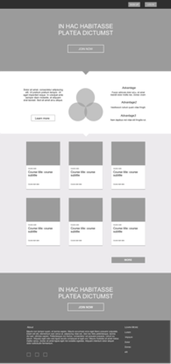
The understanding of what information is important to the user, what would entice them to sign up, and what might confuse them can also be learnt from the user journey. From this exercise, the basic flow of information of the landing page can be determined.
Design
To make this information relatable and easier for users to understand, integrating graphic content, pictures with tagline, and implementing a clear hierarchy of text style definitely helps.
At this stage, it’s important to still not get too stuck on tiny details like tweaking every kerning between letters, or writing the perfect copy, but to instead focus on the general flow and presentation style of the information. Also, it’s important to constantly check-in with developer during this process to see if the design is doable from the developer’s perspective. The design portion is just half of the website and receiving affirmation from the other half is equally important.
It’s worth noting here that with Open edX instances, we think that not having a prominent and meaningful splash page telling potential learners about the offering is a lost opportunity. It is also an opportunity to build the brand more and do something fun. So building on the default landing page with the main hero image, we like to expand more and talk more about the offering with clear messaging and call to actions, in a modern full-page layout.
Colors
Often clients provide a style guide with primary and secondary color palettes of the brand in which case the color styling would mainly be a matter of establishing clear hierarchy with selected colors within the page to emphasize certain buttons of information. When the style guide isn’t provided or is considered to be too minimal, there are many online tools that can be utilized to assemble great color palette like Adobe Kuler, or Colllor.
Often font families are specified in the style guide, but when they’re not, there are tons of free fonts provided on Google Fonts. Be wary of using paid fonts that might not be supported by all browsers and of course, never comic sans.
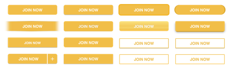
Buttons
There have been many successful iterations of a button design, but the real trick is knowing how to combine its high-priority stature (making people want to click on it) while at the same time harmonizing with the rest of the page’s elements.To achieve a consistent style of buttons throughout the platform, it is essential to check in with the developer to see if the style of the button can be implemented not just on this page, but sitewide.
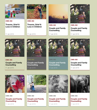
There’s no better way to create a responsive layout and a coherent display of information than using system of cards. In edX, cards are used to not only organize courses but can also be used to display perks of the platform or testimonials of the users. While there are lots of guides online to create the perfect card, the one from Google Material is highly recommended to use.
Pre-Implementation
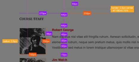
This process involves creating style guides for implementing the design onto the live page. There are many tools that can help designers create specification guides with pixel to pixel perfection, the plugin Measure for Sketch being one of them. You not only have the ability to turn a rectangle into a height guide using “lite height”, but also can obtain the property of an object without any significant hassle.
Another problem that every designer and developer duo run into more than often is when the design is rendered unimplementable and needs to be altered; causing a storm of headaches and frustration. For this we recommend the designer and developer to be in close contact through the definition and build out process, and then standardize the solution for future implementations.
While it can be frustrating at times, the sweet satisfaction that you’ve successfully designed and implemented a Open edX site that fully satisfies your customer and their learners is always the most rewarding part.